Conducted Research and Designed the UX and the UI of the Woods Center Responsive Website. Visit Website ↗
Conducted Research and Designed the UX and the UI of the Woods Center Responsive Website. Visit Website ↗
Overview
Overview
The project idea was from the owner of Renderforest, a well known company in Armenia, where he wanted to create a space at the outskirts of Yerevan to host different events, give spaces for companies to be based at the center and to give the opportunity to IT professionals who worked remotely to have a dedicated coworking spot for them to do their work.
The project idea was from the owner of Renderforest, a well known company in Armenia, where he wanted to create a space at the outskirts of Yerevan to host different events, give spaces for companies to be based at the center and to give the opportunity to IT professionals who worked remotely to have a dedicated coworking spot for them to do their work.
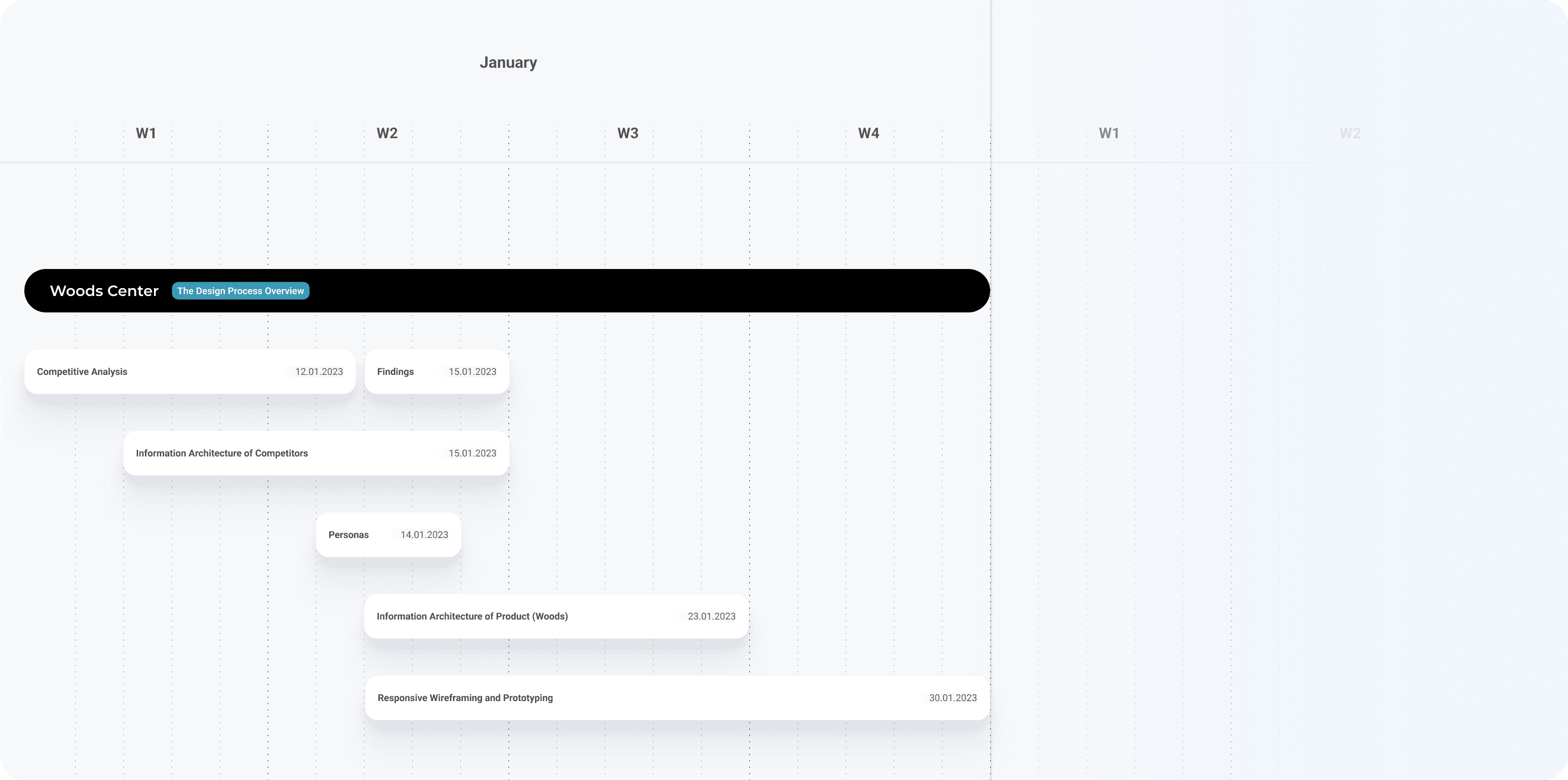
I had the opportunity to understand the business goals, understand what competitors they had seen either direct or indirect and delivered a roadmap that mapped out what the plans were regarding the different stages of the design process
I had the opportunity to understand the business goals, understand what competitors they had seen either direct or indirect and delivered a roadmap that mapped out what the plans were regarding the different stages of the design process

Research // SWOT Analysis
Research // SWOT Analysis
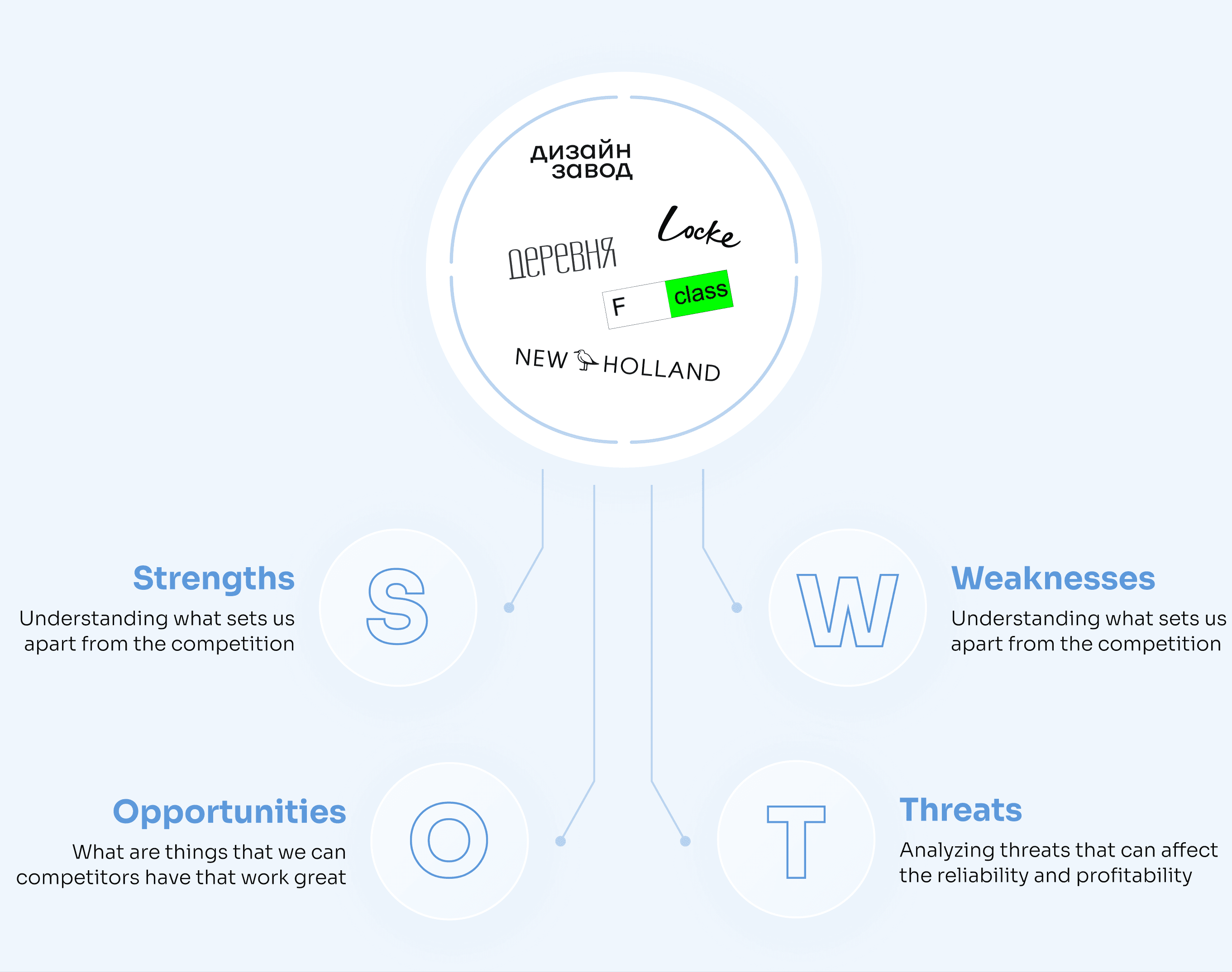
After the roadmap was agreed upon, I started with a SWOT analysis of competitors they had mentioned and a few competitors I found they had value and created this detailed analysis of the indirect competitors. During this analysis of understanding the key features and strong suits of each competitor, I came to the conclusion that the best competitor to us in terms of usability and aesthetics is the “Locke” which offered beautifully designed apartments in Europe. (We also wanted to have an “Appartments” section), and thus that competitor was the one that I chose to put it under the microscope to understand its entire architecture.During this analysis of understanding the key features and strong suits of each competitor, I came to the conclusion that the best competitor to us in terms of usability and aesthetics is the “Locke” which offered beautifully designed apartments in Europe. (We also wanted to have an “Appartments” section), and thus that competitor was the one that I chose to put it under the microscope to understand its entire architecture.
After the roadmap was agreed upon, I started with a SWOT analysis of competitors they had mentioned and a few competitors I found they had value and created this detailed analysis of the indirect competitors. During this analysis of understanding the key features and strong suits of each competitor, I came to the conclusion that the best competitor to us in terms of usability and aesthetics is the “Locke” which offered beautifully designed apartments in Europe. (We also wanted to have an “Appartments” section), and thus that competitor was the one that I chose to put it under the microscope to understand its entire architecture.During this analysis of understanding the key features and strong suits of each competitor, I came to the conclusion that the best competitor to us in terms of usability and aesthetics is the “Locke” which offered beautifully designed apartments in Europe. (We also wanted to have an “Appartments” section), and thus that competitor was the one that I chose to put it under the microscope to understand its entire architecture.


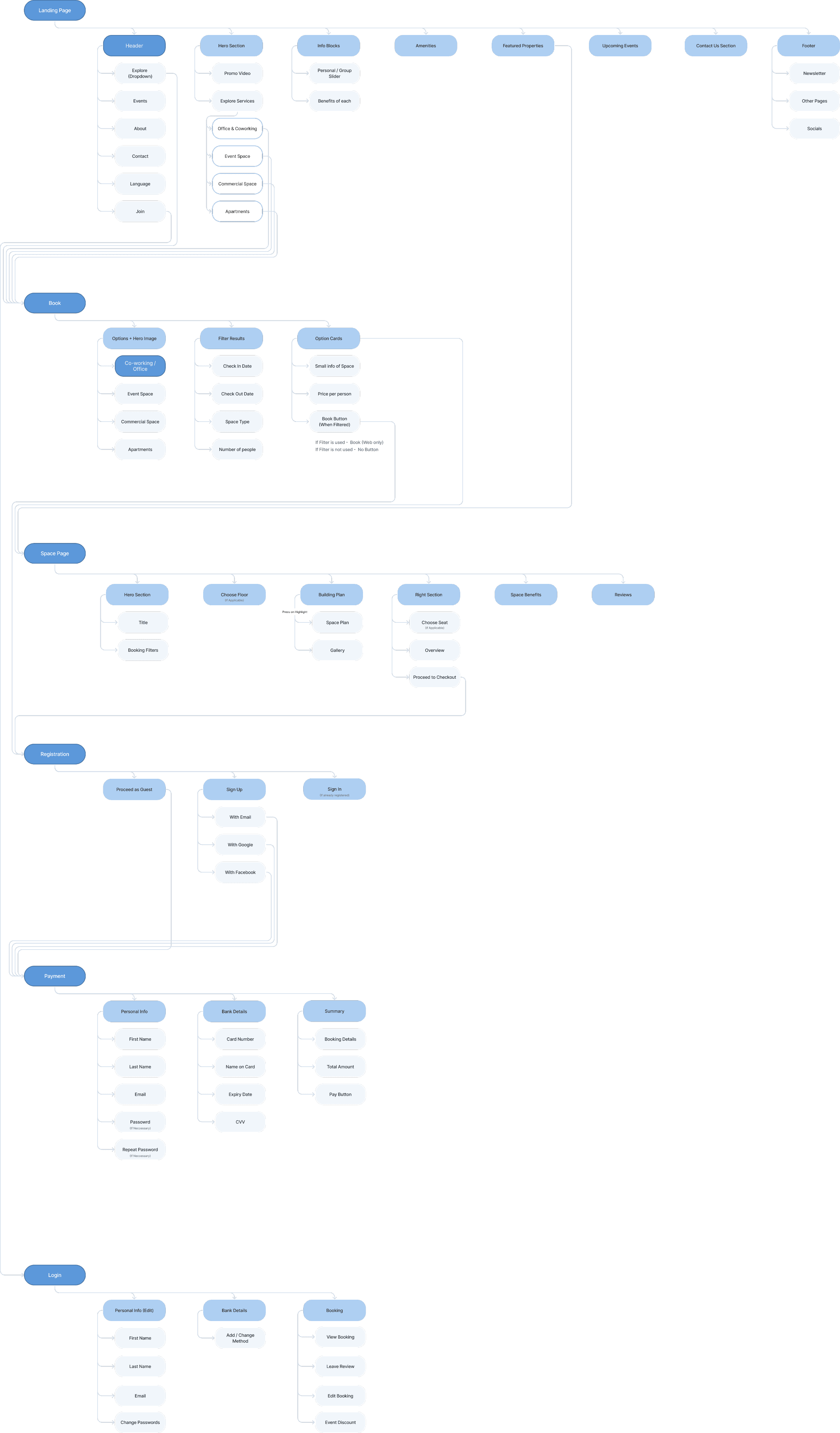
Information Architecture (Competitor & Woods Center)
Information Architecture
(Competitor & Woods Center)
During this analysis of understanding the key features and strong suits of each competitor, I came to the conclusion that the best competitor to us in terms of usability and aesthetics is the “Locke” which offered beautifully designed apartments in Europe. (We also wanted to have an “Appartments” section), and thus that competitor was the one that I chose to put it under the microscope to understand its entire architecture.During this analysis of understanding the key features and strong suits of each competitor, I came to the conclusion that the best competitor to us in terms of usability and aesthetics is the “Locke” which offered beautifully designed apartments in Europe. (We also wanted to have an “Appartments” section), and thus that competitor was the one that I chose to put it under the microscope to understand its entire architecture.During this analysis of understanding the key features and strong suits of each competitor, I came to the conclusion that the best competitor to us in terms of usability and aesthetics is the “Locke” which offered beautifully designed apartments in Europe. (We also wanted to have an “Appartments” section), and thus that competitor was the one that I chose to put it under the microscope to understand its entire architecture.
During this analysis of understanding the key features and strong suits of each competitor, I came to the conclusion that the best competitor to us in terms of usability and aesthetics is the “Locke” which offered beautifully designed apartments in Europe. (We also wanted to have an “Appartments” section), and thus that competitor was the one that I chose to put it under the microscope to understand its entire architecture. During this analysis of understanding the key features and strong suits of each competitor, I came to the conclusion that the best competitor to us in terms of usability and aesthetics is the “Locke” which offered beautifully designed apartments in Europe. (We also wanted to have an “Appartments” section), and thus that competitor was the one that I chose to put it under the microscope to understand its entire architecture.During this analysis of understanding the key features and strong suits of each competitor, I came to the conclusion that the best competitor to us in terms of usability and aesthetics is the “Locke” which offered beautifully designed apartments in Europe. (We also wanted to have an “Appartments” section), and thus that competitor was the one that I chose to put it under the microscope to understand its entire architecture.


Persona Creation
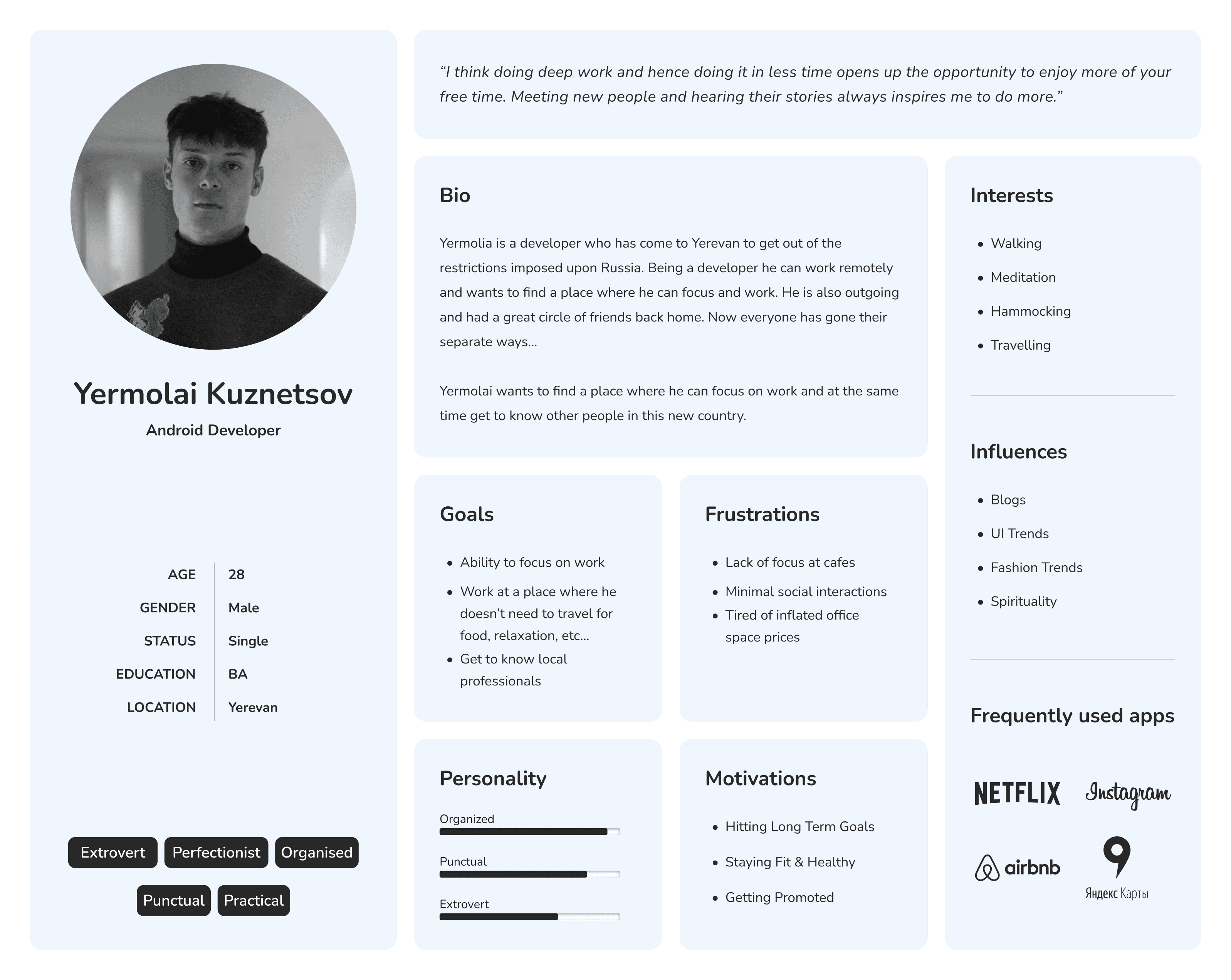
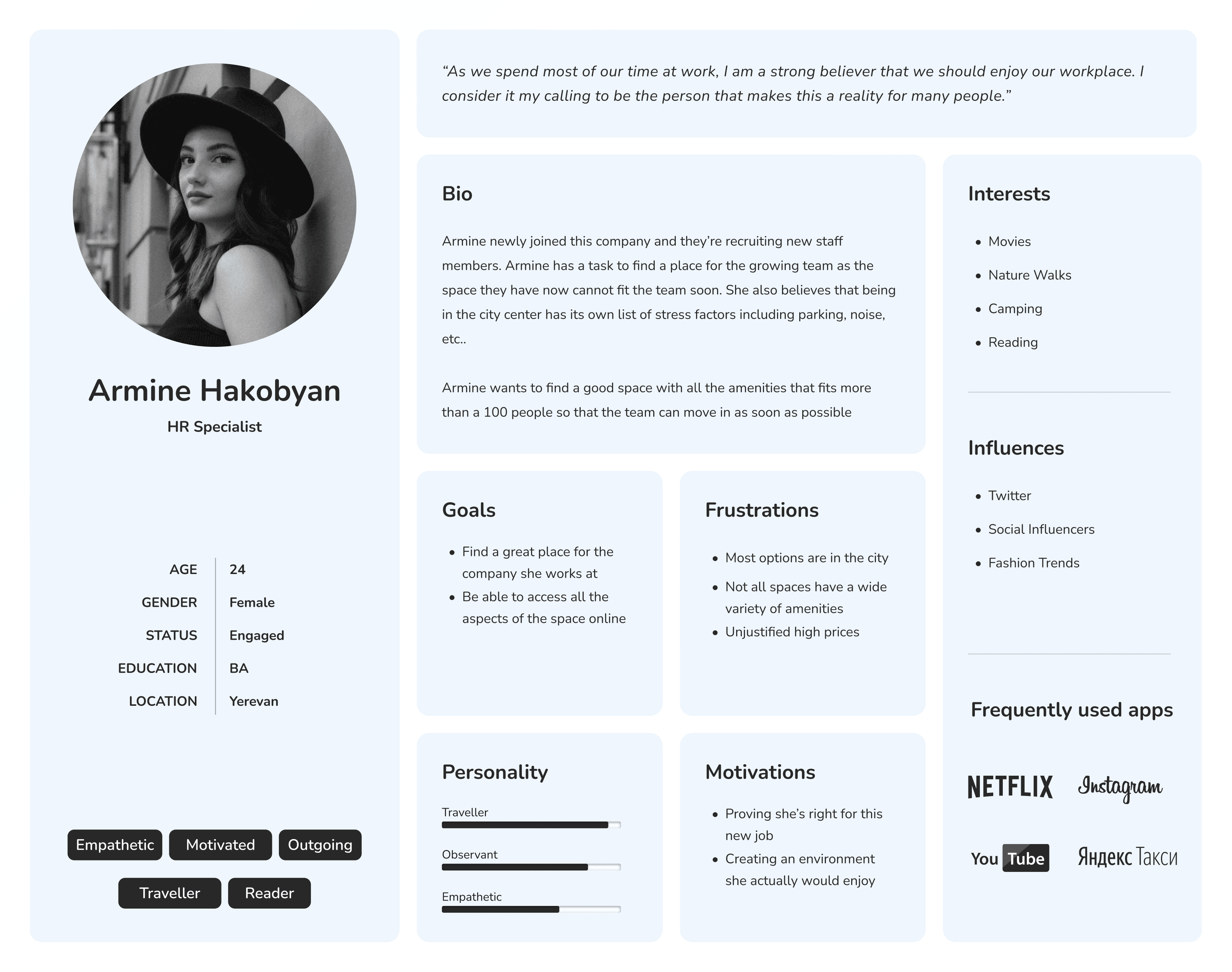
Persona Creation
After the roadmap was agreed upon, I started with a SWOT analysis of competitors they had mentioned and a few competitors I found they had value and created this detailed analysis of the indirect competitors. During this analysis of understanding the key features and strong suits of each competitor, I came to the conclusion that the best competitor to us in terms of usability and aesthetics is the “Locke” which offered beautifully designed apartments in Europe. (We also wanted to have an “Appartments” section), and thus that competitor was the one that I chose to put it under the microscope to understand its entire architecture.During this analysis of understanding the key features and strong suits of each competitor, I came to the conclusion that the best competitor to us in terms of usability and aesthetics is the “Locke” which offered beautifully designed apartments in Europe. (We also wanted to have an “Appartments” section), and thus that competitor was the one that I chose to put it under the microscope to understand its entire architecture.
After the roadmap was agreed upon, I started with a SWOT analysis of competitors they had mentioned and a few competitors I found they had value and created this detailed analysis of the indirect competitors. During this analysis of understanding the key features and strong suits of each competitor, I came to the conclusion that the best competitor to us in terms of usability and aesthetics is the “Locke” which offered beautifully designed apartments in Europe. (We also wanted to have an “Appartments” section), and thus that competitor was the one that I chose to put it under the microscope to understand its entire architecture.During this analysis of understanding the key features and strong suits of each competitor, I came to the conclusion that the best competitor to us in terms of usability and aesthetics is the “Locke” which offered beautifully designed apartments in Europe. (We also wanted to have an “Appartments” section), and thus that competitor was the one that I chose to put it under the microscope to understand its entire architecture.


Component Creation & Planning the UI
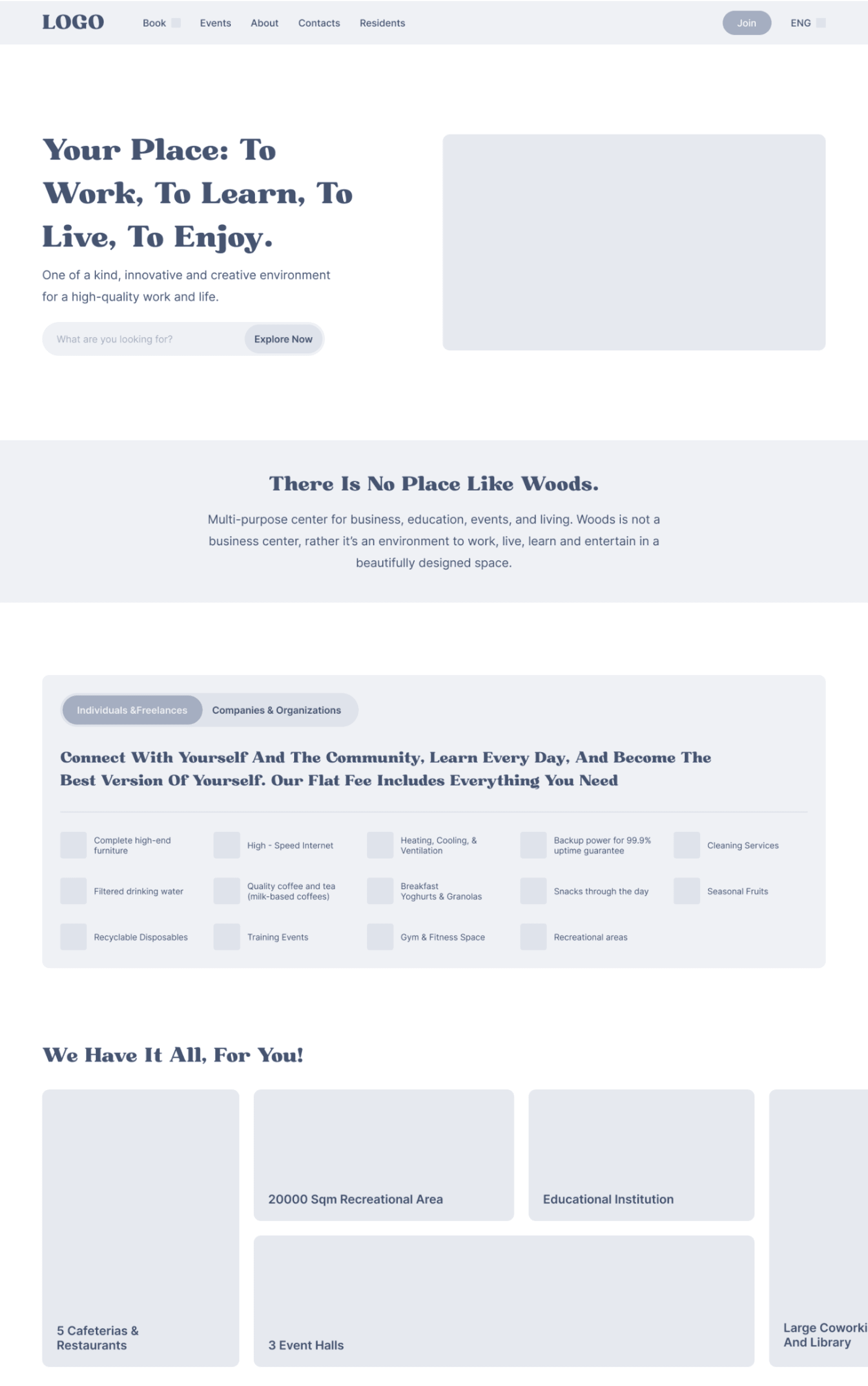
Component Creation
& Planning the UI
After the roadmap was agreed upon, I started with a SWOT analysis of competitors they had mentioned and a few competitors I found they had value and created this detailed analysis of the indirect competitors. During this analysis of understanding the key features and strong suits of each competitor, I came to the conclusion that the best competitor to us in terms of usability and aesthetics is the “Locke” which offered beautifully designed apartments in Europe. (We also wanted to have an “Appartments” section), and thus that competitor was the one that I chose to put it under the microscope to understand its entire architecture.During this analysis of understanding the key features and strong suits of each competitor, I came to the conclusion that the best competitor to us in terms of usability and aesthetics is the “Locke” which offered beautifully designed apartments in Europe. (We also wanted to have an “Appartments” section), and thus that competitor was the one that I chose to put it under the microscope to understand its entire architecture.
After the roadmap was agreed upon, I started with a SWOT analysis of competitors they had mentioned and a few competitors I found they had value and created this detailed analysis of the indirect competitors. During this analysis of understanding the key features and strong suits of each competitor, I came to the conclusion that the best competitor to us in terms of usability and aesthetics is the “Locke” which offered beautifully designed apartments in Europe. (We also wanted to have an “Appartments” section), and thus that competitor was the one that I chose to put it under the microscope to understand its entire architecture.During this analysis of understanding the key features and strong suits of each competitor, I came to the conclusion that the best competitor to us in terms of usability and aesthetics is the “Locke” which offered beautifully designed apartments in Europe. (We also wanted to have an “Appartments” section), and thus that competitor was the one that I chose to put it under the microscope to understand its entire architecture.







Styles & Components
Styles & Components
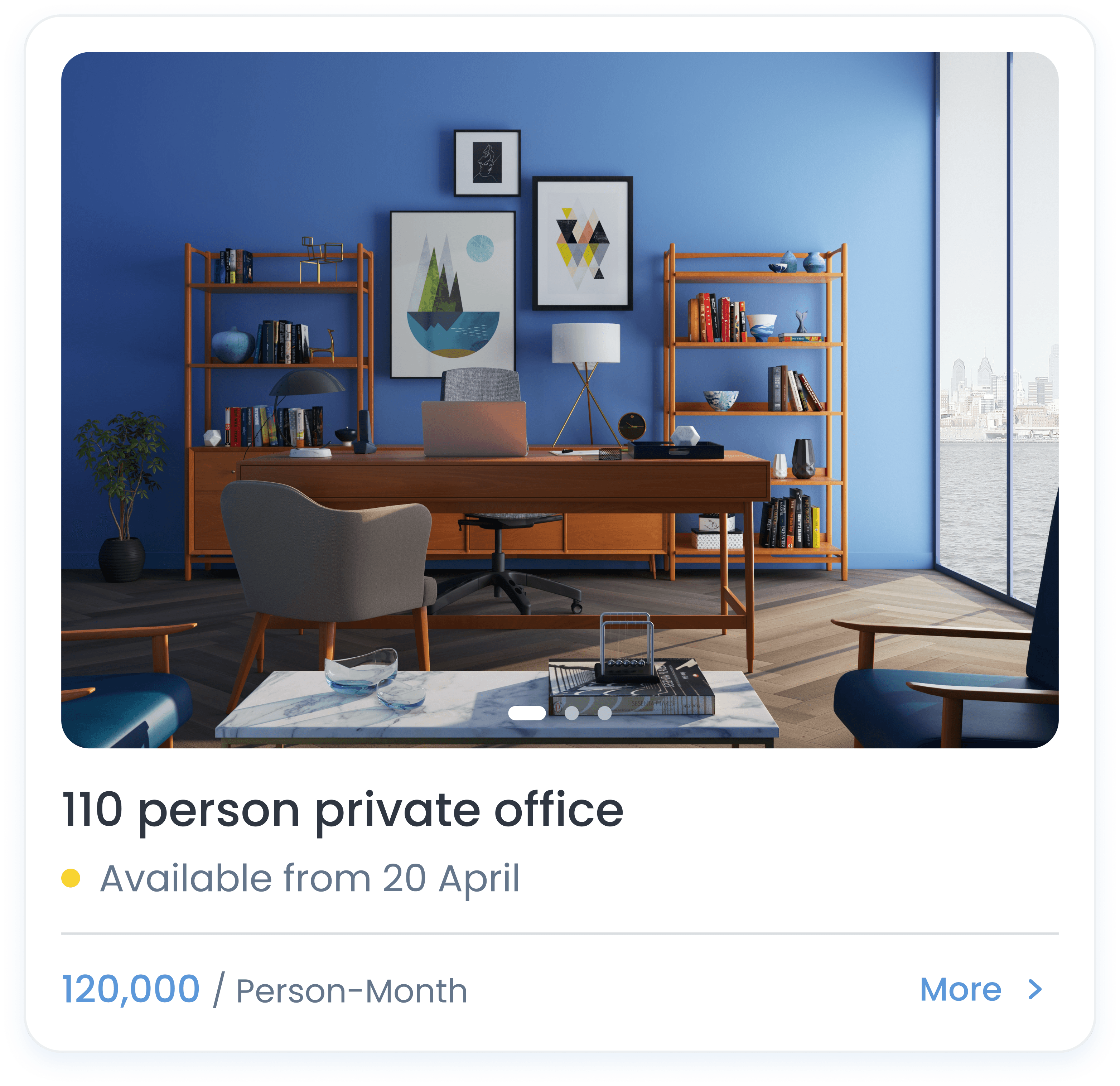
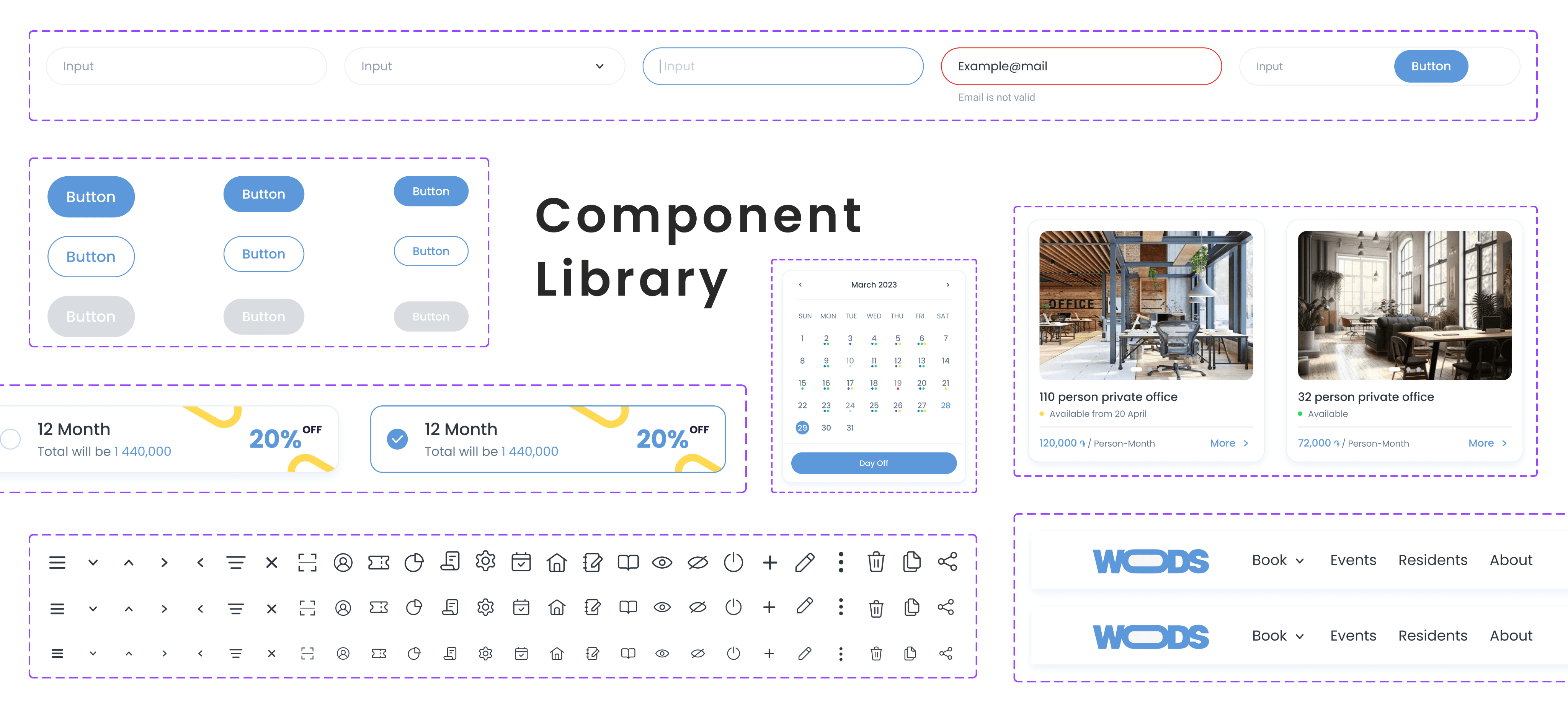
To ensure consistency across the product, we established a clear visual language through colors, typography, and reusable components. The color palette was chosen to reflect the brand identity while maintaining accessibility and contrast standards. Typography was defined with a hierarchy that balances readability and visual harmony, making it easy to apply across different screens. We then created a set of core UI components—such as buttons, inputs, and navigation elements—built from these foundations. This system not only streamlined the design process but also enabled faster development and easier scalability as the product evolved.
To ensure consistency across the product, we established a clear visual language through colors, typography, and reusable components. The color palette was chosen to reflect the brand identity while maintaining accessibility and contrast standards. Typography was defined with a hierarchy that balances readability and visual harmony, making it easy to apply across different screens. We then created a set of core UI components—such as buttons, inputs, and navigation elements—built from these foundations. This system not only streamlined the design process but also enabled faster development and easier scalability as the product evolved.




User Interface Design
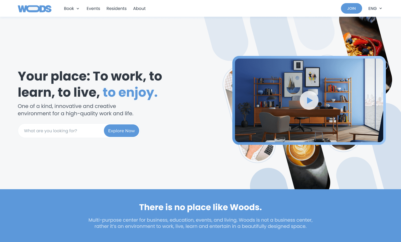
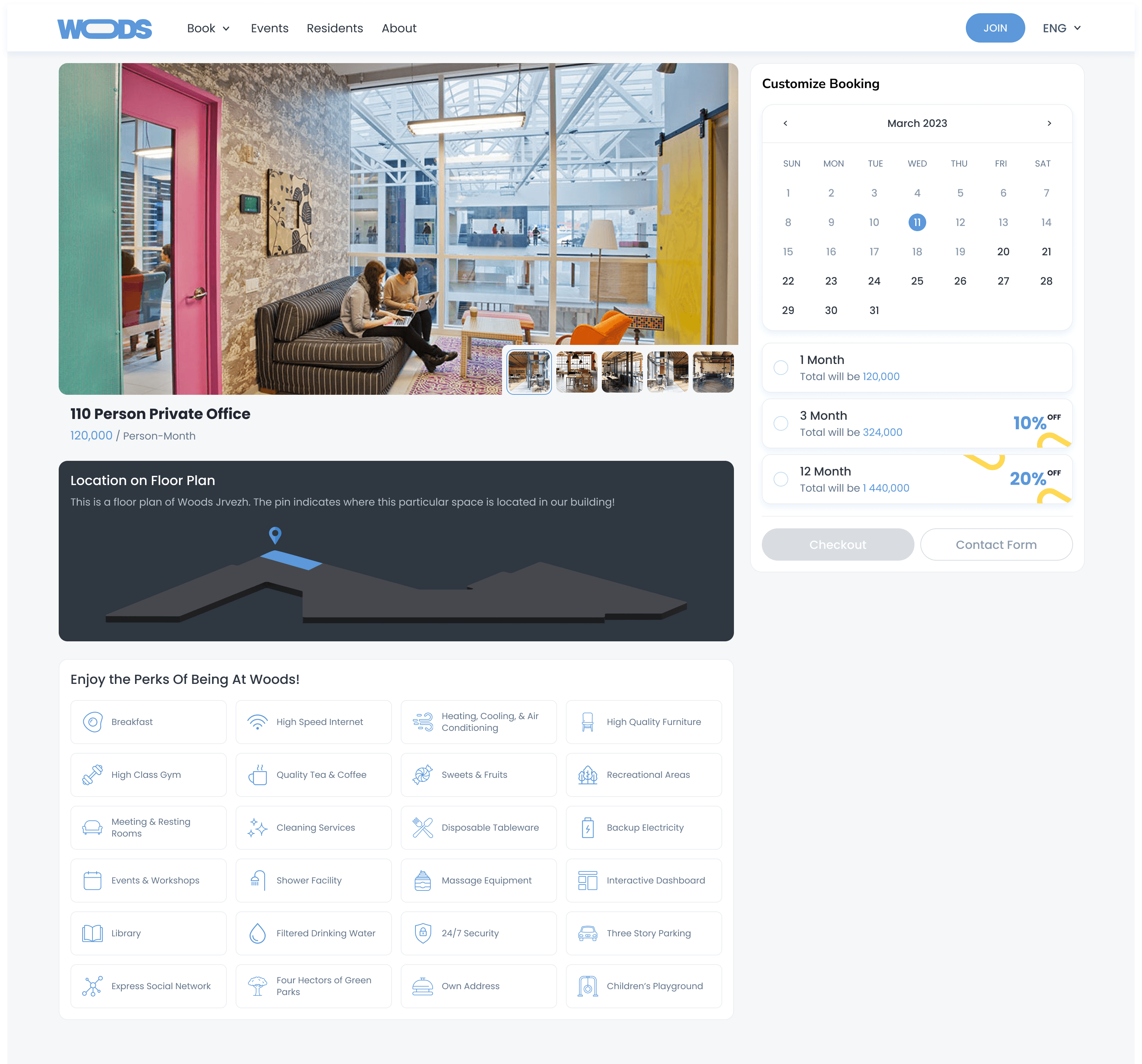
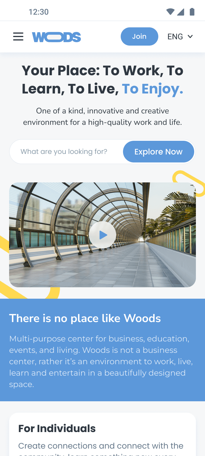
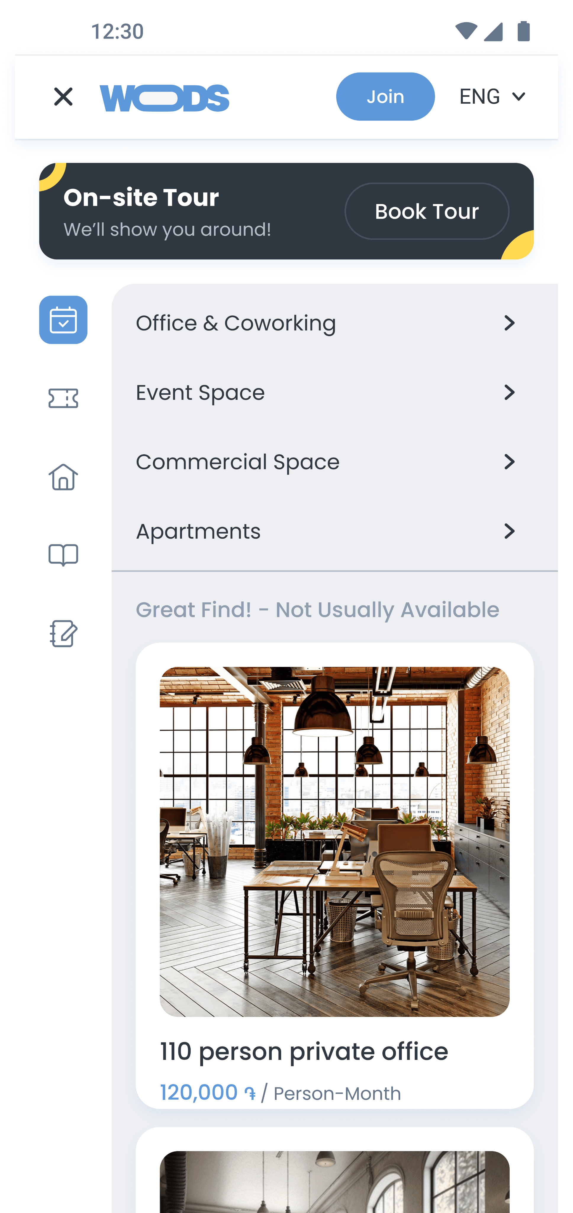
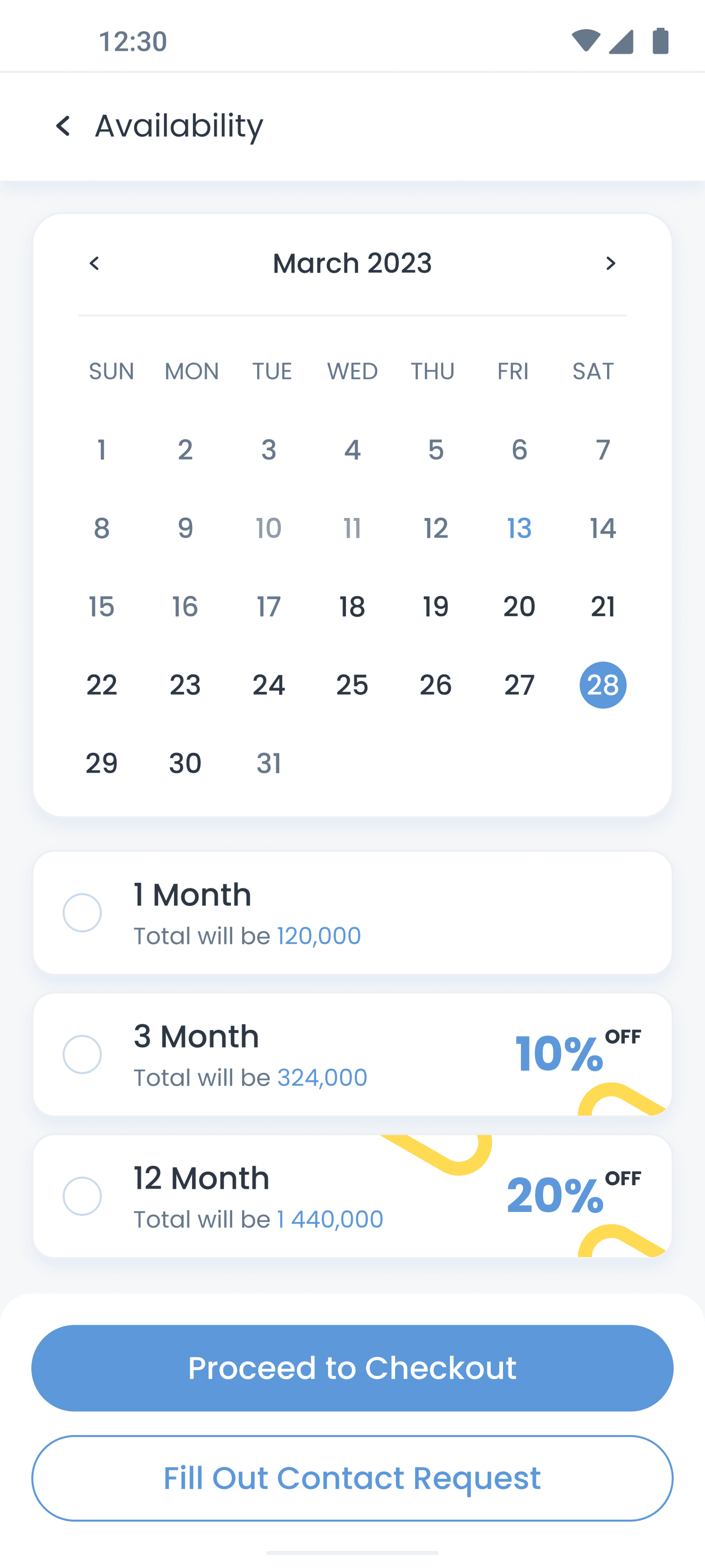
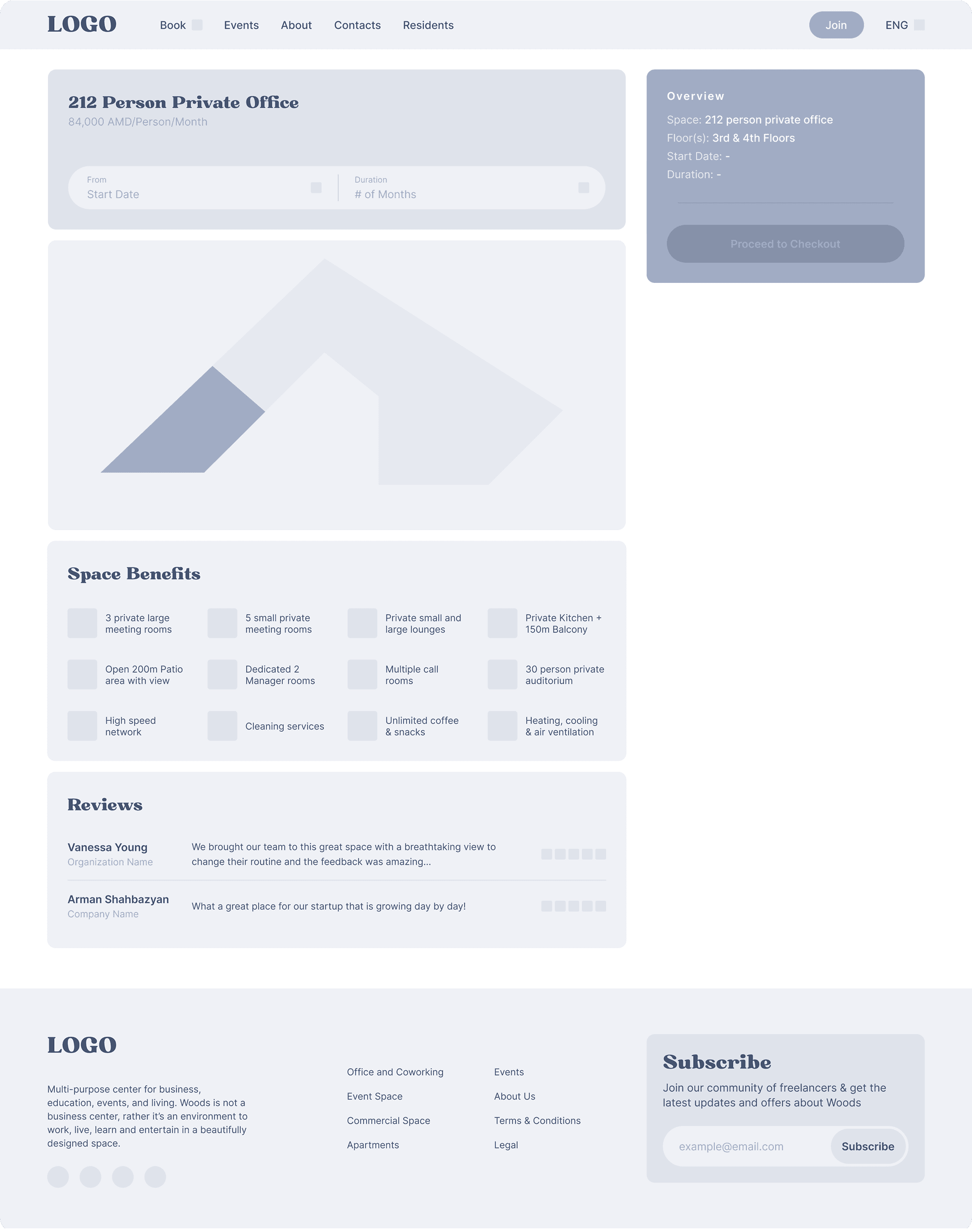
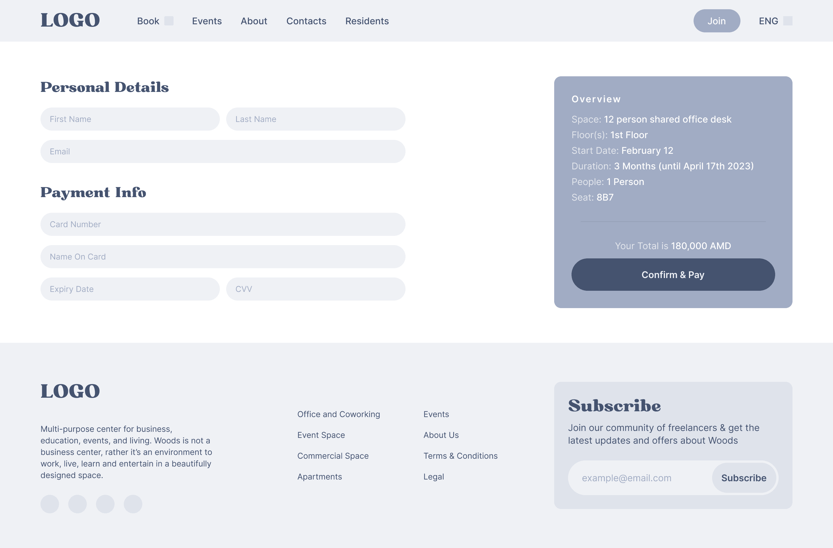
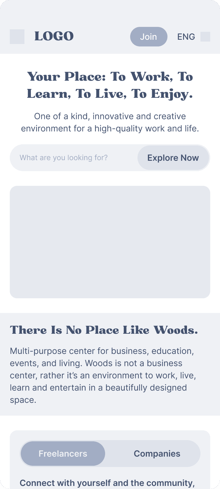
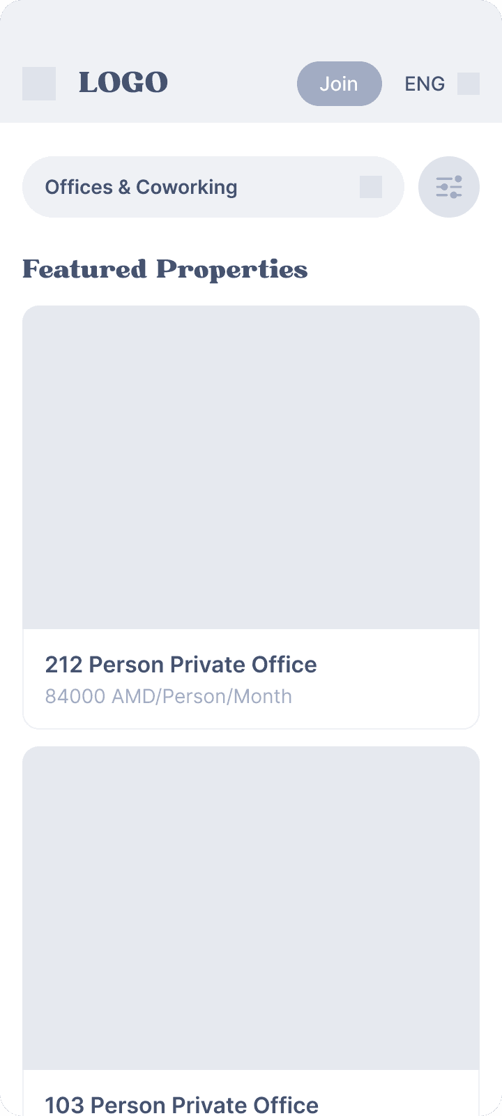
After setting up the design system, we moved on to creating the actual screens. Here you can see a mix of desktop and mobile mockups that show how everything comes together in context. To make it feel more real, we also put together a short demo video that highlights some of the key interactions and flows. This step was important because it helped everyone get a sense of how the product would actually look and feel in use—not just as static designs.
After setting up the design system, we moved on to creating the actual screens. Here you can see a mix of desktop and mobile mockups that show how everything comes together in context. To make it feel more real, we also put together a short demo video that highlights some of the key interactions and flows. This step was important because it helped everyone get a sense of how the product would actually look and feel in use—not just as static designs.
